Milbur Plumbing
A plumbing company looking to embrace the digital landscape in Australia by providing premium and comprehensive plumbing solutions.
SERVICE
Brand Identity + Style Guide + Business Cards + Website
INDUSTRY
Plumbing
COUNTRY
Australia
The Challenge:
I was approached by two South African expats to undertake the branding of their new initiative - Milbur Plumbing. It is a new company that has been named after their father, and is looking to continue his legacy into a new age... but with a bold vision. They are not your run-off-the-mill operation and do not want to be seen as such.
Their target market is specifically focused on corporates and somewhat senior home owners as the financial climate in Sydney is such that the young-to-middle aged cannot afford expensive housing.
They are also very passionate about the environment and are aware that they play a major role in it's sustainability, and as a result their operation is geared towards the eco-conscious.


The Process:
Milbur Plumbing was set on establishing themselves as a modern, premium and innovative plumbing company providing 360-solutions that can all be booked, ordered and purchased online through their portal.
The logo execution saw the merger of a handful of the brands key elements (Name + Trade + Corporate + Nature + Heritage), but done in a manner that is unforced and overly embellished, as the trade industry generally calls for a simpler mark or icon that evokes strength and trust.
The green color was suggested by client and is a nice nod to the brand's eco-conscious stance.
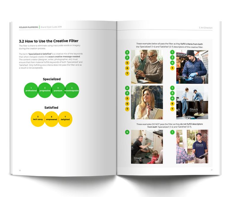
The fonts sees the pairing of a bold and robust display font underpinned by a thinly-weighted uppercase slab. With these two contrasting fonts we have an ideal typography set for any future collateral.
LIGHTBULB MOMENT:
A successfully designed mark embodies multiple brand USPs executed in a manner appropriate to the industry.

Website
On the completion of the branding, I was tasked with rolling out the front-end design for their development team to build off of.
This is where the style scape comes into play. Other than being a powerful part of the presentation, it essentially provides the brand's visual language which can be carried across to any brand collateral required.

Testimonial
Clint is an absolute pleasure to work with and his attention to detail with his designs is really good. The entire process was fantastic as he took us through multiple comprehensive brand identity options, and helped during the finalization with providing tweaks and refinement as well as providing his expert opinion along the way.
Nolene Burger, Managing Director
Business card
A standard part of any branding project is the design of corporate stationery, most notably, business cards.
I was overjoyed that the client was receptive to having a premium quality card, and was in love with the idea of rounded corners and a slick matte varnish finish which would really drive home the identity and status of the brand and resonate with it's audience, be it the corporates or the wealthy home-owners.


